Volopa Lifestyle Web Platform
Client
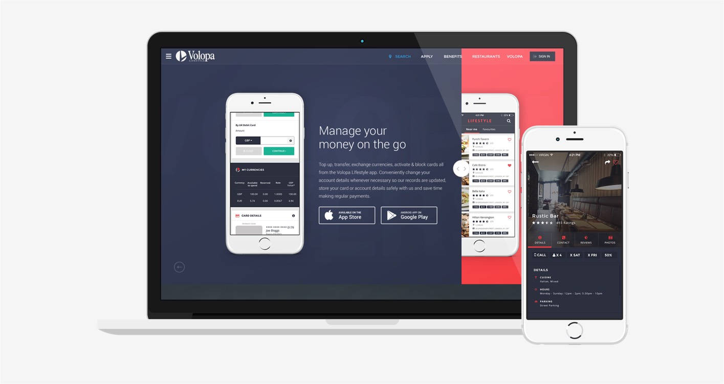
Volopa are a fintech company, offering their customers a multi-currency prepaid Mastercard® app. Customers can hold and instantly swap between 14 currencies on one card as well as receive cash back on a number of restaurants nationwide when dining and going out.
Disciplines
- Competitor research & market audit
- Product / brand UX audit
- User journeys
- User stories
- Customer development
- Product (UX / UI) design
- Features roadmap development
- Wireframing & interactive prototype
Brief
Volopa needed a platform that would help them track and manage data for all of their customers as their existing platform had no way of capturing data from card payments.
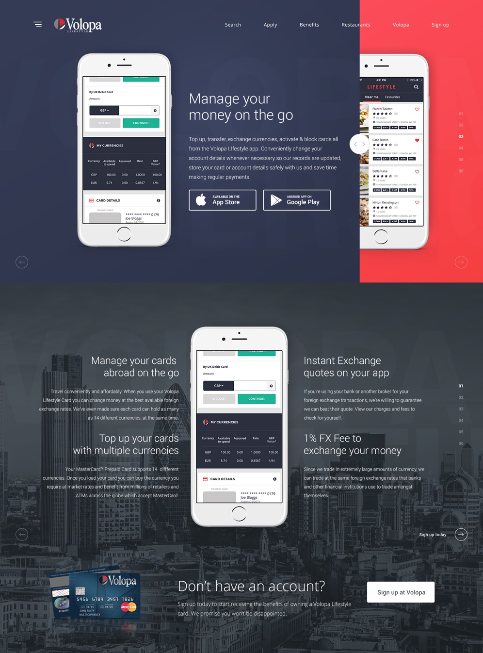
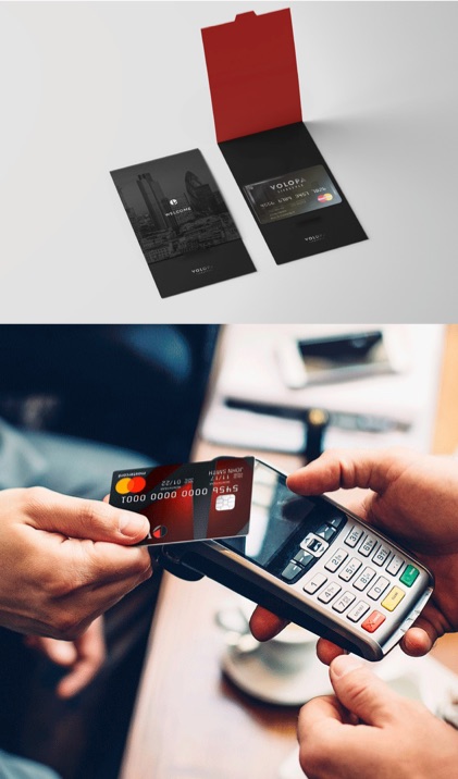
Volopa commissioned my team at Soho to design and build a cross platform B2C web app platform that would be accessible on desktop, iOS and Andoid.
My team consisted of front and back end developers, with myself as the product designer for the overall project. I worked closely with key stakeholders, including the head of business development at Volopa to deliver an MVP experiment to market on a tight schedule. The aim was to perform extensive user testing and research once launched, to simulate whether or not Volopa users were interested in a this proposed product.
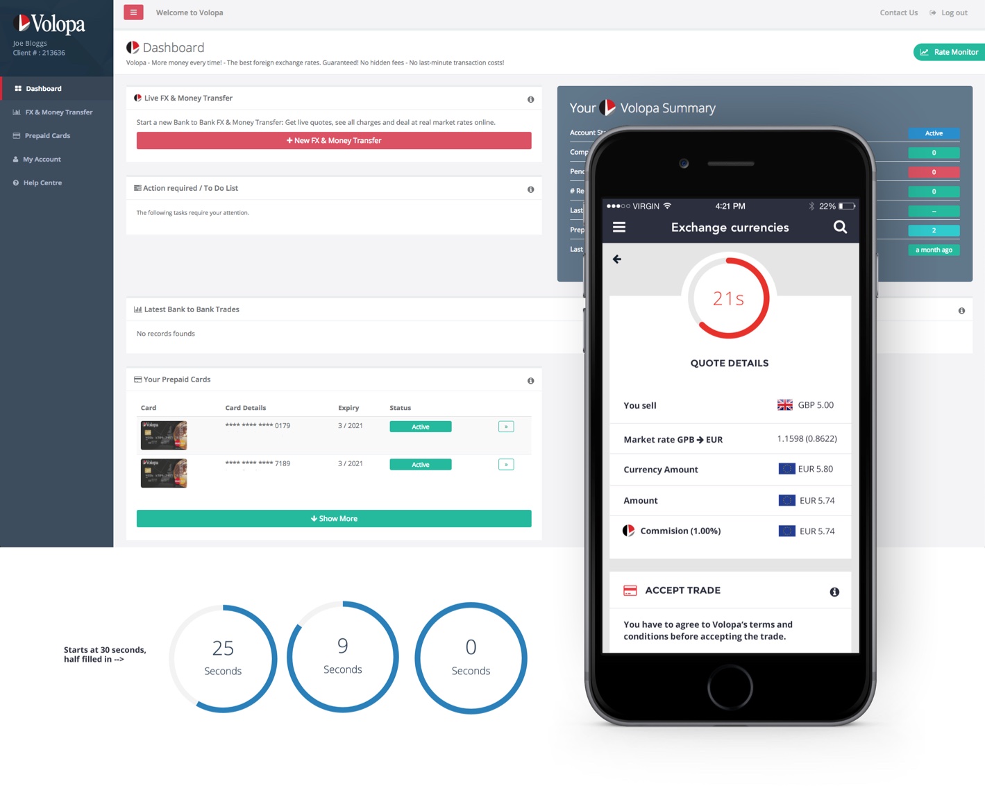
Exchange feature
One of the main requirements from Volopa was to provide the ability for customers to manage their money on the go and exchange their money in real time.
The exchange screen required a 30 second timer in order to provide the best exchange rate for the customer, along with a tick box to accept the trade.
I designed various iterations on Sketch and After Effects to test what solution was the most intuitive and tested the ideas internally and on usertesting.com.
The desktop screen shot shows the existing exchange rate feature on the Volopa platform. The final design consisted of an animated timer and quote that sticks to the top of the screen as the user scrolls down to accept the trade.
Research
The team, alongside the marketing director, conducted various user interviews with existing and potential business clients, to understand what their values are.
We asked questions such as –How do you manage your different currencies when traveling? How do you exchange your money?
We wanted to prove our various assumptions – that users wanted to manage their money on the go and receive cash back or discounts at participating venues.
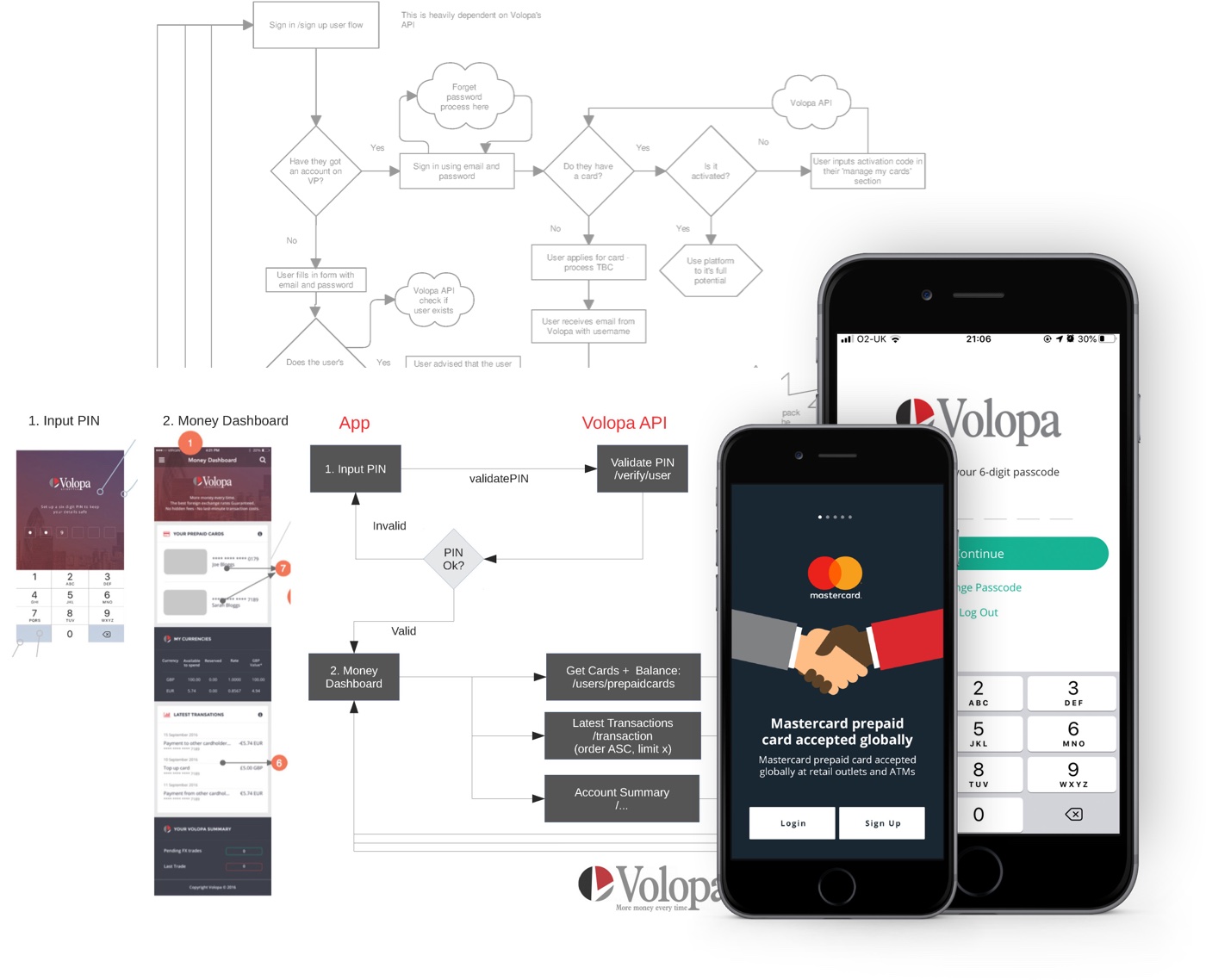
Onboarding
Part of the MVP exercise was to develop and design a new onboarding process for new customers.
I analysed Volopa’s existing onboarding and card activation process and touch points as well as competitors’ and documented each step of the process.
During the analysis stage of the process, we realised that the existing process was cumbersome. It required an admin staff member to perform a credit check and get in touch with each new applicant. This was also a pain point for existing customers and we knew this to be a genuine problem.
I brainstormed and wireframed different user journey flows and together with the team, we decided to prioritise automating the onboarding process as much as possible.
Ideation
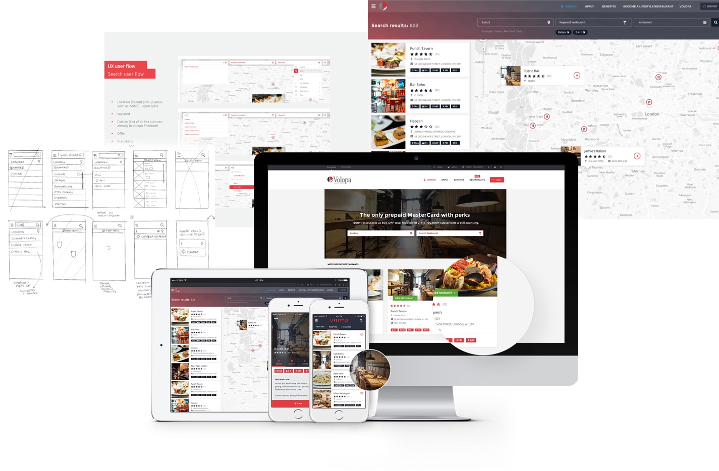
As part of the ideation step of the process, I sketched out different user flows and journeys, presented findings in daily stand ups and weekly board meetings and built an interactive prototype in Sketch and exported it to Invision using Craft.
I built a user flow on Sketch for the Manage my Money section to help the development team understand which steps or tasks in the journey required API calls.
I also constructed several task analysis flow diagrams to help the team understand how we could integrate our mobile app platform with the existing platform. One of the challenges with merging two platforms was to manage two separate onboarding processes with existing Volopa users and new Volopa Lifestyle users.
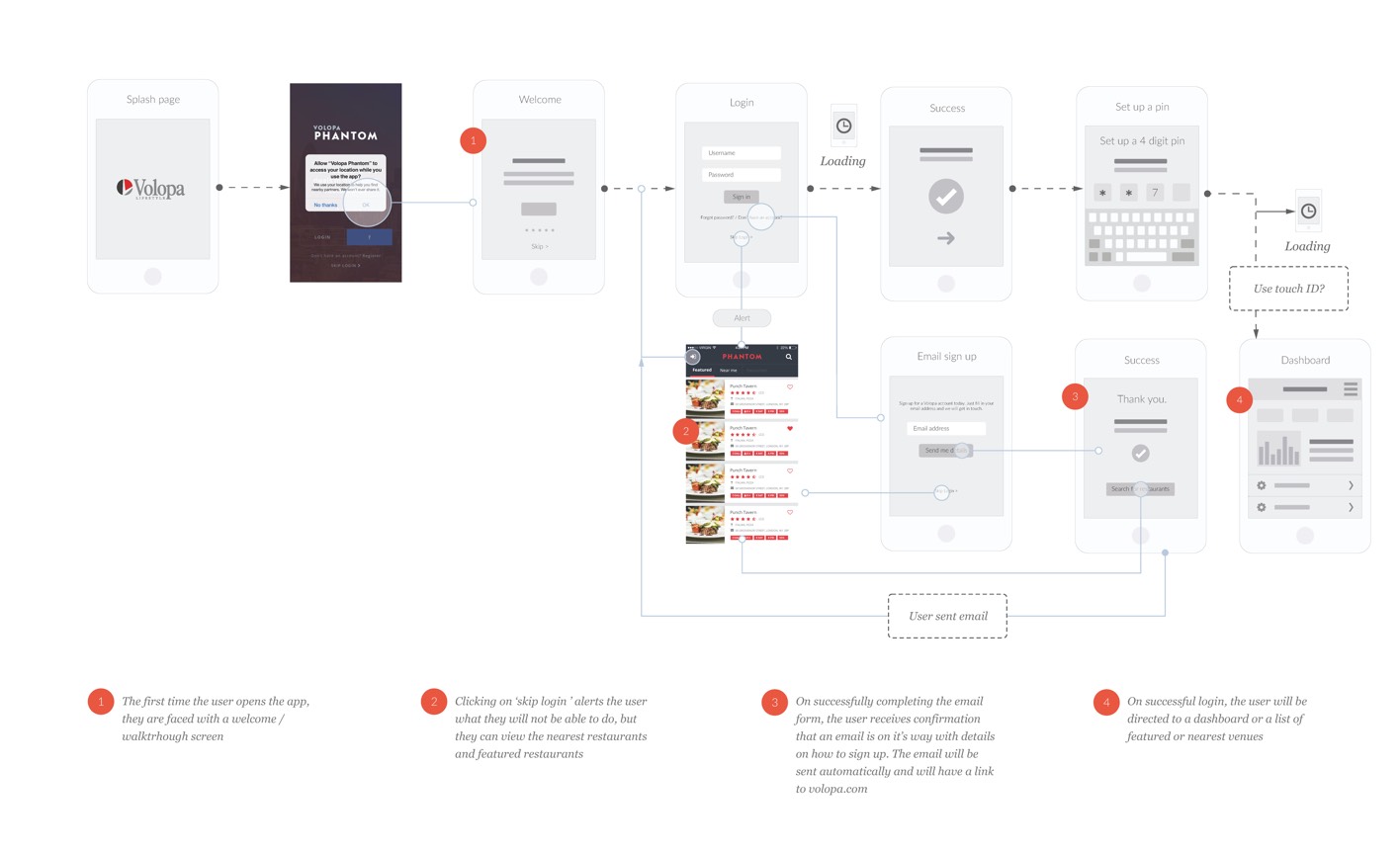
Initial login process
Example wireframe to show my thinking through the user journey for the signing in to the app for the first time.
UX/UI for Volopa Lifestyle
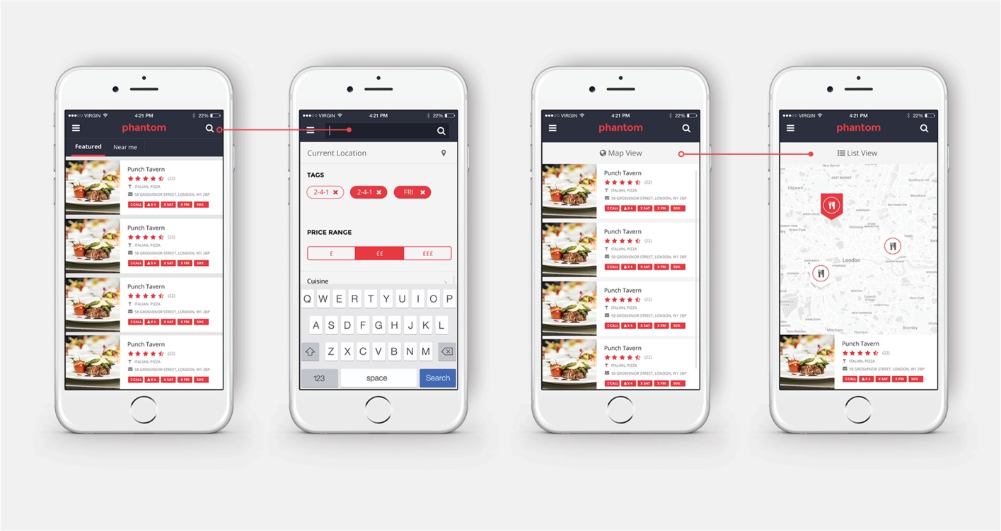
The other major part of the Volopa platform was the reward program offering called ‘Volopa Lifestyle’. With the Volopa Lifestyle card the customer can receive discounts at hotels, spas and restaurants across the UK.
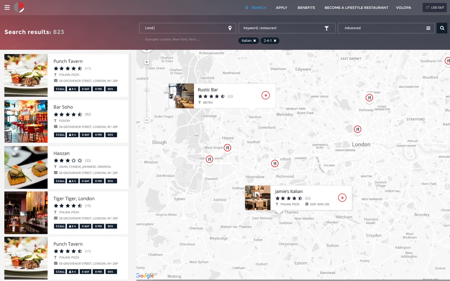
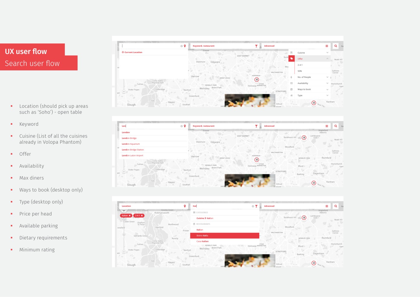
Showing sketch and UI examples of the interactive map and search functionality.
Volopa admin dashboard portal
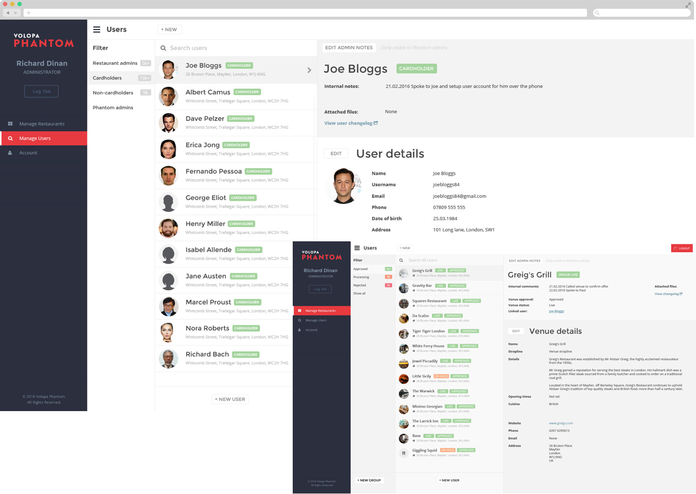
Example screens designed for the Business admin dashboard. Internal administrators can manage business users and venue profiles.
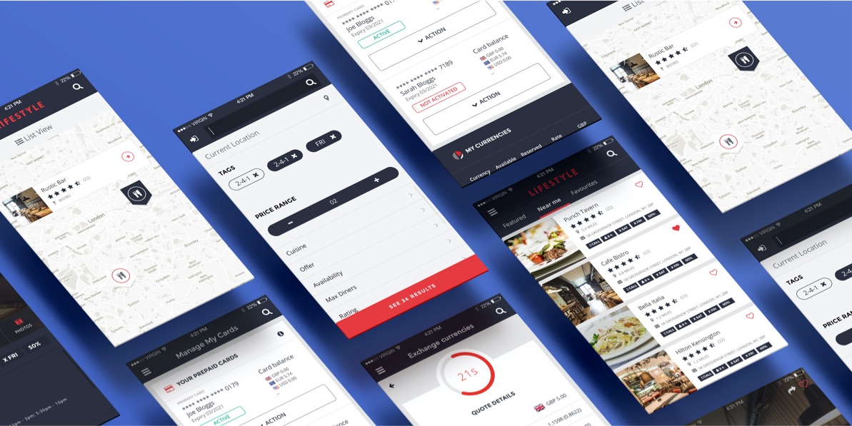
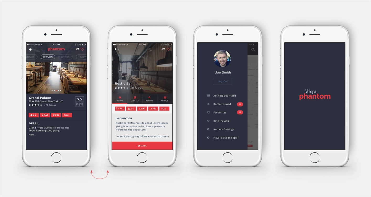
Example UI screen designs
MVP user requirements:
- Sign up for a new Volopa account with new onboarding automation tools
- Manage their money:
- Exchange their money in real time
- Top up their cards
- Transfer funds instantly between cards
- Earn cash back when dining and going out
- Redeem offers on a number of venues nationwide
UX Design
Displaying various examples of UX design for Volopa – from exploring various use cases and user journey to wireframing and developing a working prototype in Sketch / Craft/ Invision.
Deliverables
We produced a hybrid mobile app instead of a native app for Apple and Android. This significantly reduced the development costs and provided flexibility to add functionality more quickly.
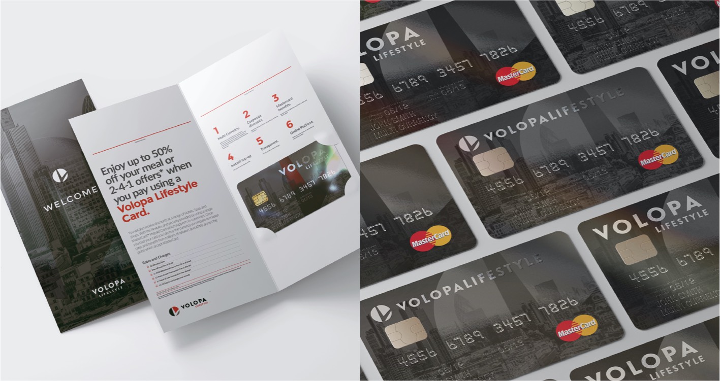
I also delivered a series of presentations with recommendations for the UX and marketing strategy, as well as designs for branded material such as their welcome pack and Mastercard® design.
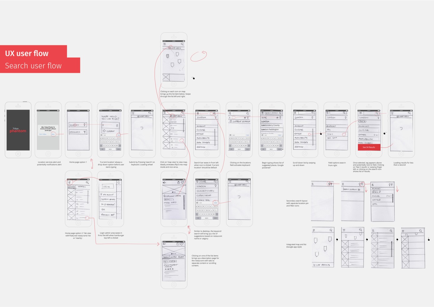
Example search user flow ideas
Branding and design
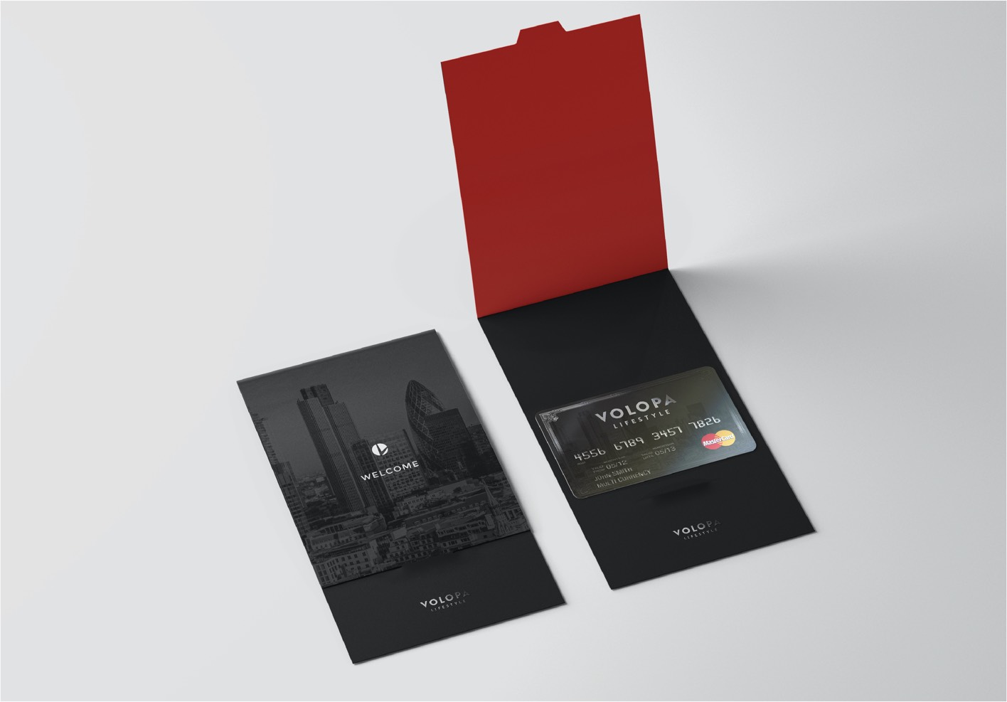
I designed collateral material for Volopa including a members' pack, Mastercard® design and other printed marketing material.
